半円グラフ、半ドーナッツグラフでも、きれいに簡単に表示できる。
Highcharts(非商用使用-フリー/商用使用-有料)は、優れたデザイン性にレスポンシブなグラフを描画をしてくれる JavaScriptライブラリです。
Highcharts以外のグラフライブラリは、円グラフでデータラベルやラベルなどを表示できますが、それらを円の外側にきれいに表示するものがありません。
Highchartsは、円グラフでデータラベルやラベルなどを円の外側に表示するのが、標準の機能です。
このページで扱うグラフはつぎのとおりです。
Highcharts.jsファイルは、 HighchartsのCDNサイトを使用すると、ダウンロードが不要になります。なお、jQueryは不要となりました。
使い方はつぎのとおりです。
   <!-- グラフ表示域  -->
   <div id="container" style="width:100%; height:400px;"></div>

   <!-- グラフ描写 -->
   <script>
    var myChart = Highcharts.chart('container', {
           chart: {
               type: 'pie'            // グラフの種類(円、ドーナッツグラフ)
           },

            ・・・

    });
   </script>
Highchartsの円グラフは、ラベルの表示は引き出し線付きで円の外側に表示されます(標準デフォルト機能)。
下のグラフは、基本的な円グラフとドーナッツグラフのサンプルデモとそのHTMLコードを表示しています。
<!DOCTYPE html>
<head lang="ja">
<meta charset="UTF-8" />
<title>円グラフ基本サンプル(円)</title>
<script src="http://code.highcharts.com/highcharts.js"></script> <!-- highcharts -->
</head>
<body>
<!-- グラフ表示域  -->
<div id="container" style="width: 80%; height: 400px; margin: 0 auto"></div>

<!-- グラフ描写 -->
<script>
 var myChart = Highcharts.chart('container', {
        chart: {
            type: 'pie'            // グラフの種類(円、ドーナッツグラフ)
        },
        title: {
            text: '男女別 総人口 平成29年1月1日現在'    // グラフのタイトル
        },
        plotOptions: {
            pie: {
              dataLabels: {
                enabled: true,
                //distance: -50   // ラベルなどを引き出し線なしで円の中に表示する場合指定する
                },
            }
        },

        series: [        // 表示データ
            {
                name: '人口',   // データの名前
                data: [
                    [ '男', 6173 ],
                    [ '女', 6513 ]
                ]
            }
        ],
       colors: ['#0000ff', '#ff0000']   // データ(面)の背景色

 });
</script>

</body>
</html>
<!DOCTYPE html>
<head lang="ja">
<meta charset="UTF-8" />
<title>円グラフ基本サンプル(ドーナッツ)</title>
<script src="http://code.highcharts.com/highcharts.js"></script> <!-- highcharts -->
</head>
<body>
<!-- グラフ表示域  -->
<div id="container" style="width: 80%; height: 400px; margin: 0 auto"></div>

<!-- グラフ描写 -->
<script>
 var myChart = Highcharts.chart('container', {
        chart: {
            type: 'pie'            // グラフの種類(円、ドーナッツグラフ)
        },
        title: {
            text: '男女別 総人口 平成29年1月1日現在'    // グラフのタイトル
        },
        plotOptions: {
            pie: {
              dataLabels: {
                enabled: true,
                //distance: -50      // ラベルなどを引き出し線なしで円の中に表示する場合指定する
                },
                innerSize: '40%'     // ドーナッツグラフの場合指定する、グラフの内側のサイズ
            }
        },

        series: [        // 表示データ
            {
                name: '人口',   // データの名前
                data: [
                    [ '男', 6173 ],
                    [ '女', 6513 ]
                ]
            }
        ],
       colors: ['#0000ff', '#ff0000']   // データ(面)の背景色

 });
</script>

</body>
</html>
サンプルグラフは、下表のとおり円グラフおよびドーナッツグラフの8種類になります。それぞれ、表の項番のクリックで該当グラフへリンクします。
同じく、表のグラフ名のクリックで該当グラフのデモを新しいウインドウで見ることができます。
サンプルグラフで表示するラベルなどの種類はつぎのとおりになります。
| 項番 | サンプルグラフ (クリックして新ウインドウでデモが見れます) |
非表示ラベル *1 (マウスオーバー時表示) | 常時表示ラベル *2 (グラフ面の外側に表示) | 備考 | ||||||
| ラベル | データラベル | 割合% | 合計 | ラベル | データラベル | 割合% | 合計 | |||
| 3.1 | 円グラフ (pie) | name | y | percentage | total | name | y | percentage | total | |
| 3.2 | ドーナッツグラフ (donut) | name | y | percentage | total | name | y | percentage | total | |
| 3.3 | 3D 円グラフ(3D pie) | name | y | percentage | total | name | y | percentage | total | |
| 3.4 | 3D ドーナッツグラフ(3D donut) | name | y | percentage | total | name | y | percentage | total | |
| 3.5 | 半円グラフ (Semi circle pie) | name | y | percentage | total | name | y | percentage | total | |
| 3.6 | 半ドーナッツグラフ (Semi circle donut) | name | y | percentage | total | name | y | percentage | total | |
| 3.7 | 3D 半円グラフ(3D Semi circle pie) | name | y | percentage | total | name | y | percentage | total | |
| 3.8 | 3D 半ドーナッツグラフ(3D Semi circle donut) | name | y | percentage | total | name | y | percentage | total | |
| 注記 |
ラベル表示記述のソースコード(*1, *2) *1;
formatter: function() {return this.point.name + ':' + this.y + '/'+ this.total +'万台 - ' + Math.round(this.percentage*10)/10 + '%';},
*2;
format: '<b>{point.name}</b>: {point.percentage:.1f} % <br>{point.y}/{series.total} 万台',
| |||||||||
3.1 円グラフ → 3.2 ドーナッツグラフ → 3.6 半ドーナッツグラフ
 ↓      ↓
 ↓   3.3 3D 円グラフ →  3.4 3D ドーナッツグラフ  → 3.8 3D 半ドーナッツグラフ
 ↓              ↓
3.5 半円グラフ   3.7 3D 半円グラフ
<!DOCTYPE html>
<html lang="ja">
<head>
<meta charset="UTF-8">
<!-- レスポンシブ 全デバイス対応 -->
<meta name="viewport" content="width=device-width,initial-scale=1.0,minimum-scale=1.0,maximum-scale=1.0,user-scalable=no">
<title>Highcharts.jsを使って円グラフを描く(標準)</title>

<!-- Highcharts  -->
<script src="https://code.highcharts.com/highcharts.js"></script>

<style>
/* レスポンシブ スマホ用のCSS例 */
@media only screen and (max-width: 480px) {
    #body { margin-left: 0; }	/* body */
    #container { margin: 0 auto; text-align: center; } 	/* グラフ container */
}
</style>
</head>
<body id=body>
<!-- グラフ表示域 -->
<div id="container" style="width:100%; height:450px;"></div>

<!-- グラフ描写 -->
<script>
Highcharts.chart('container', {
    chart: {
        plotBackgroundColor: null,
        plotBorderWidth: null,
        plotShadow: false,
        type: 'pie'
    },
    title: {
        text: '自動車主要8社2016年国内生産実績(万台)'
    },
    tooltip: {     // ラベル非表示 マウスオーバーで表示
        enabled:true,
        formatter: function() {return this.point.name + ':' + this.y + '/'+ this.total +'万台 - ' + Math.round(this.percentage*10)/10 + '%';},
    },

    credits: {
        enabled: true,
        position: { align: 'right',
               x: -100,
               verticalAlign: 'bottom',
                y: -5 },
        style: { cursor: 'pointer', color: '#909090',fontSize: '12px' } ,
        text: "(c)Highcarts"
    },

    plotOptions: {
        pie: {
            allowPointSelect: true,
            cursor: 'pointer',
            showInLegend: true,       //凡例表示
            dataLabels: {
                enabled: true,
                format: '<b>{point.name}</b>: {point.percentage:.1f} % <br>{point.y}/{series.total} 万台',  // ラベル常時表示
                style: {
                    //color: (Highcharts.theme && Highcharts.theme.contrastTextColor) || 'black'
                }
            }
        }
    },
  series: [{
        name: '',
        colorByPoint: true,
        data: [{name: 'トヨタ', y: 316, sliced: true, selected: true},  //data書き方1
               {name: 'マツダ', y: 97},
               {name: '日産', y: 95},
               {name: 'ホンダ', y: 82},
               {name: 'スズキ', y: 79},
               {name: '富士重', y: 73},
               {name: 'ダイハツ', y: 72},
               {name: '三菱自', y: 55}
         ]
        //data: [['トヨタ',316],              //data書き方2
        //       ['マツダ',97],
        //       ['日産',95],
        //        ['ホンダ',82],
        //        ['スズキ',79],
        //        ['富士重',73],
        //        ['ダイハツ',72],
        //        ['三菱自',55]
        //]
    }],
    colors: ['#2f7ed8', 'green', '#8bbc21', '#910000', '#1aadce','purple', '#f28f43', 'red'] //データの色
});
</script>

</body>
</html>
    tooltip: {     // ラベル非表示 マウスオーバーで表示
        enabled:true,
        formatter: function() {return this.point.name + ':' + this.y + '/'+ this.total +'万台 - ' + Math.round(this.percentage*10)/10 + '%';},
    },
            dataLabels: {
                enabled: true,
                format: '<b>{point.name}</b>: {point.percentage:.1f} % <br>{point.y}/{series.total} 万台',  // ラベル常時表示
                style: {
                    //color: (Highcharts.theme && Highcharts.theme.contrastTextColor) || 'black'
                }
            }
    credits: {
        enabled: true,
        position: { align: 'right',
               x: -100,
               verticalAlign: 'bottom',
                y: -5 },
        style: { cursor: 'pointer', color: '#909090',fontSize: '12px' } ,
        text: "(c)Highcarts"
    },
        pie: {

            showInLegend: true,       //凡例表示

        }
colors: ['#2f7ed8', 'green', '#8bbc21', '#910000', '#1aadce','purple', '#f28f43', 'red'] //データの色
        data: [{name: 'トヨタ', y: 316, sliced: true, selected: true},  //data書き方1
               {name: 'マツダ', y: 97},
               ・・・

         }
        data: [['トヨタ',316],              //data書き方2
               ['マツダ',97],
               ・・・

         }
<!DOCTYPE html>
<html lang="ja">
<head>
<meta charset="UTF-8">
<!-- レスポンシブ 全デバイス対応 -->
<meta name="viewport" content="width=device-width,initial-scale=1.0,minimum-scale=1.0,maximum-scale=1.0,user-scalable=no">
<title>Highcharts.jsを使ってドーナッツグラフを描く(標準)</title>

<!-- Highcharts  -->
<script src="https://code.highcharts.com/highcharts.js"></script>

<style>
/* レスポンシブ スマホ用のCSS例 */
@media only screen and (max-width: 480px) {
    #body { margin-left: 0; }	/* body */
    #container { margin: 0 auto; text-align: center; } 	/* グラフ container */
}
</style>
</head>
<body id=body>
<!-- グラフ表示域 -->
<div id="container" style="width:100%; height:450px;"></div>

<!-- グラフ描写 -->
<script>
Highcharts.chart('container', {
    chart: {
        plotBackgroundColor: null,
        plotBorderWidth: null,
        plotShadow: false,
        type: 'pie'
    },
    title: {
        text: '自動車主要8社2016年国内生産実績(万台)'
    },
    tooltip: {     // ラベル非表示 マウスオーバーで表示
        enabled:true,
        formatter: function() {return this.point.name + ':' + this.y + '/'+ this.total +'万台 - ' + Math.round(this.percentage*10)/10 + '%';},
    },

    credits: {
        enabled: true,
        position: { align: 'right',
               x: -100,
               verticalAlign: 'bottom',
                y: -5 },
        style: { cursor: 'pointer', color: '#909090',fontSize: '12px' } ,
        text: "(c)Highcarts"
    },

    plotOptions: {
        pie: {
            innerSize: '40%',   // ドーナッツグラフの場合、円の中心部の切り抜きの長さ '99%'か数値px
            allowPointSelect: true,
            cursor: 'pointer',
            showInLegend: true,       //凡例表示
            dataLabels: {
                enabled: true,
                format: '<b>{point.name}</b>: {point.percentage:.1f} % <br>{point.y}/{series.total} 万台',  // ラベル常時表示
                style: {
                    //color: (Highcharts.theme && Highcharts.theme.contrastTextColor) || 'black'
                }

            }
        }
    },
  series: [{
        name: '',
        colorByPoint: true,
        //data: [{name: 'トヨタ', y: 316, sliced: true, selected: true},  //data書き方1
        //       {name: 'マツダ', y: 97},
        //       {name: '日産', y: 95},
        //       {name: 'ホンダ', y: 82},
        //       {name: 'スズキ', y: 79},
        //       {name: '富士重', y: 73},
        //       {name: 'ダイハツ', y: 72},
        //       {name: '三菱自', y: 55}
        // ]
        data: [['トヨタ',316],              //data書き方2
               ['マツダ',97],
               ['日産',95],
               ['ホンダ',82],
               ['スズキ',79],
               ['富士重',73],
               ['ダイハツ',72],
               ['三菱自',55]
        ]
    }],
    colors: ['#2f7ed8', 'green', '#8bbc21', '#910000', '#1aadce','purple', '#f28f43', 'red'] //データの背景色
});
</script>

</body>
</html>
  pie: {
     innerSize: '40%',   // ドーナッツグラフの場合、円の中心部の切り抜きの長さ '99%'か数値px,

   }
<!DOCTYPE html>
<html lang="ja">
<head>
<meta charset="UTF-8">
<!-- レスポンシブ 全デバイス対応 -->
<meta name="viewport" content="width=device-width,initial-scale=1.0,minimum-scale=1.0,maximum-scale=1.0,user-scalable=no">
<title>Highcharts.jsを使って円グラフを描く(3D)</title>

<!-- Highcharts 本体 / 3D -->
<script src="https://code.highcharts.com/highcharts.js"></script>
<script src="http://code.highcharts.com/highcharts-3d.js"></script>

<style>
/* レスポンシブ スマホ用の例 */
@media only screen and (max-width: 480px) {
    #body { margin-left: 0; }	/* body */
    #container { margin: 0 auto; text-align: center; }	/* グラフ container */
}
</style>
</head>
<body>
<!-- グラフ表示域 -->
<div id="container" style="width:100%; height:450px;"></div>

<!-- グラフ描写 -->
<script>
Highcharts.chart('container', {
    chart: {
        plotBackgroundColor: null,
        plotBorderWidth: null,
        plotShadow: false,
        type: 'pie',
        options3d: {   //3D
          enabled: true,     //グラフを3Dに設定
          alpha: 20,         // z 軸を中心にした回転(奥のほうに上向きで倒れる)する角度
          beta: 20,          // x 軸を中心にした左方向に回転する角度
          //depth: 50,       /// ドーナッツの内側の厚さ(深さ)
          }
    },
    title: {
        text: '自動車主要8社2016年国内生産実績(万台)'
    },
    tooltip: {     // ラベル非表示 マウスオーバーで表示
        enabled:true,
        formatter: function() {return this.point.name + ':' + this.y + '/'+ this.total +'万台 - ' + Math.round(this.percentage*10)/10 + '%';},
    },

    credits: {
        enabled: true,
        //href:  'https://www.highcharts.com/',
        position: { align: 'right',
               x: -100,
               verticalAlign: 'bottom',
                y: -5 },
        style: { cursor: 'pointer', color: '#909090',fontSize: '12px' } ,
        text: "(c)Highcarts" //, target: '_blank'
    },

    plotOptions: {
        pie: {
            //innerSize: 80,   // 円(未定義/0)かドーナッツ '40%',
            depth: 50,         // 円の外側の厚さ(深さ)
            allowPointSelect: true,
            cursor: 'pointer',
            showInLegend: true,       //凡例表示
            dataLabels: {
                enabled: true,
                format: '<b>{point.name}</b>: {point.percentage:.1f} % <br>{point.y}/{series.total} 万台',  // ラベル常時表示
                style: {
                    //color: (Highcharts.theme && Highcharts.theme.contrastTextColor) || 'black'
                }

            }
        }
    },
  series: [{
        name: '',
        colorByPoint: true,
        data: [{name: 'トヨタ', y: 316, sliced: true, selected: true},  //data書き方1
               {name: 'マツダ', y: 97},
               {name: '日産', y: 95},
               {name: 'ホンダ', y: 82},
               {name: 'スズキ', y: 79},
               {name: '富士重', y: 73},
               {name: 'ダイハツ', y: 72},
               {name: '三菱自', y: 55}
         ]
        //data: [['トヨタ',316],              //data書き方2
        //       ['マツダ',97],
        //       ['日産',95],
        //        ['ホンダ',82],
        //        ['スズキ',79],
        //        ['富士重',73],
        //        ['ダイハツ',72],
        //        ['三菱自',55]
        //]
    }],
    colors: ['#2f7ed8', 'green', '#8bbc21', '#910000', '#1aadce','purple', '#f28f43', 'red'] //データの背景色
});
</script>

</body>
</html>
        options3d: {   //3D
          enabled: true,     //グラフを3Dに設定
          alpha: 20,         // z 軸を中心にした回転(奥のほうに上向きで倒れる)する角度
          beta: 20,          // x 軸を中心にした左方向に回転する角度
          //depth: 50,       // ドーナッツの内側の厚さ(深さ)
          }
        pie: {
            depth: 50,         // 円の外側の厚さ(深さ)

        }
<!DOCTYPE html>
<html lang="ja">
<head>
<meta charset="UTF-8" />
<!-- レスポンシブ 全デバイス対応 -->
<meta name="viewport" content="width=device-width,initial-scale=1.0,minimum-scale=1.0,maximum-scale=1.0,user-scalable=no">

<title>Highcharts.jsを使って3Dドーナッツグラフを描く</title>

<!-- Highcharts 本体 / 3D -->
<script src="https://code.highcharts.com/highcharts.js"></script>
<script src="http://code.highcharts.com/highcharts-3d.js"></script>

<!-- 追加 2018.7.5  スマホ用 -->
<style>
/* レスポンシブ スマホ用の例 */
@media only screen and (max-width: 480px) {
    #body { margin-left: 0; } /* body */
    #container { margin: 0 auto; text-align: center; } /* グラフ container */
}
</style>
</head>
<body>
<!-- グラフ表示域 -->
<div id="container" style="width:100%; height:450px;"></div>

<!-- グラフ描写 -->
<script>
Highcharts.chart('container', {
    chart: {
        plotBackgroundColor: null,
        plotBorderWidth: null,
        plotShadow: false,
        type: 'pie',
        options3d: {   //3D
          enabled: true,     //グラフを3Dに設定
          alpha: 20,         // z 軸を中心にした回転(奥のほうに上向きで倒れる)する角度
          beta: 20,          // x 軸を中心にした左方向に回転する角度
          depth: 50,         // ドーナッツの内側の切り抜き部分の厚さ(深さ)
          }
    },
    title: {
        text: '自動車主要8社2016年国内生産実績(万台)'
    },
    tooltip: {     // ラベル非表示 マウスオーバーで表示
        //pointFormat: '{series.name}: <b>{point.percentage:.1f}%</b>'
        //formatter: function() {return this.y +'万台';},
        enabled:true,
        formatter: function() {return this.point.name + ':' + this.y + '/'+ this.total +'万台 - ' + Math.round(this.percentage*10)/10 + '%';},
    },

    credits: {
        enabled: true,
        //href:  'https://www.highcharts.com/',
        position: { align: 'right',
               x: -100,
               verticalAlign: 'bottom',
                y: -5 },
        style: { cursor: 'pointer', color: '#909090',fontSize: '12px' } ,
        text: "(c)Highcarts" //, target: '_blank'
    },

    plotOptions: {
        pie: {
            innerSize: 80,     // ドーナッツの内側中心部の切り抜きの長さ '40%'か数値px,
            depth: 50,         // ドーナッツの外側の厚さ(深さ)
            allowPointSelect: true,
            cursor: 'pointer',
            showInLegend: true,       //凡例表示
            dataLabels: {
                enabled: true,
                format: '<b>{point.name}</b>: {point.percentage:.1f} % <br>{point.y}/{series.total} 万台',  // ラベル常時表示
                style: {
                    //color: (Highcharts.theme && Highcharts.theme.contrastTextColor) || 'black'
                }

            }
        }
    },
  series: [{
        name: '',
        colorByPoint: true,
        data: [{name: 'トヨタ', y: 316, sliced: true, selected: true},  //data書き方1
               {name: 'マツダ', y: 97},
               {name: '日産', y: 95},
               {name: 'ホンダ', y: 82},
               {name: 'スズキ', y: 79},
               {name: '富士重', y: 73},
               {name: 'ダイハツ', y: 72},
               {name: '三菱自', y: 55}
         ]
        //data: [['トヨタ',316],              //data書き方2
        //       ['マツダ',97],
        //       ['日産',95],
        //        ['ホンダ',82],
        //        ['スズキ',79],
        //        ['富士重',73],
        //        ['ダイハツ',72],
        //        ['三菱自',55]
        //]
    }],
    colors: ['#2f7ed8', 'green', '#8bbc21', '#910000', '#1aadce','purple', '#f28f43', 'red']
});
</script>

</body>
</html>
        options3d: {   //3D
          enabled: true,     //グラフを3Dに設定
          alpha: 20,         // z 軸を中心にした回転(奥のほうに上向きで倒れる)する角度
          beta: 20,          // x 軸を中心にした左方向に回転する角度
          depth: 50,         // ドーナッツの内側の厚さ(深さ)
          }
        pie: {
            innerSize: 80,     // ドーナッツの内側中心部の切り抜きの長さ '40%'か数値px,
            depth: 50,  // ドーナッツの外側の厚さ(深さ)
            ・・・
          }
<!DOCTYPE html>
<html lang="ja">
<head>
<meta charset="UTF-8" />
<!-- レスポンシブ 全デバイス対応 -->
<meta name="viewport" content="width=device-width,initial-scale=1.0,minimum-scale=1.0,maximum-scale=1.0,user-scalable=no">

<title>Highcharts.jsを使って半円グラフを描く</title>

<!-- Highcharts 本体 / 3D -->
<script src="https://code.highcharts.com/highcharts.js"></script>
<script src="http://code.highcharts.com/highcharts-3d.js"></script>

<style>
/* レスポンシブ スマホ用の例 */
@media only screen and (max-width: 480px) {
    #body { margin-left: 0; }	/* body */
    #container { margin: 0 auto; text-align: center; }  /* グラフ container */
}
</style>
</head>
<body id=body>
<!-- グラフ表示域 -->
<div id="container" style="width:100%; height:450px;"></div>

<!-- グラフ描写 -->
<script>
Highcharts.chart('container', {
    chart: {
        plotBackgroundColor: null,
        plotBorderWidth: 0,
        plotShadow: false
    },
    title: {
        text: '自動車主要8社2016年国内生産実績(万台)',
        align: 'center',
        //verticalAlign: 'middle',    // 半ドーナッツのテキストの表示位置、中心部の切り抜きの場所に表示。
        y: 40,
        style :
           {
             color: '#FF00FF',
             fontSize: '13px', // have given 50px but not changing
        }
    },
    tooltip: {
        enabled:true,     // ラベル非表示、マウスオーバーで表示
        formatter: function() {return this.point.name + ':' + this.y + '/'+ this.total +'万台 - ' + Math.round(this.percentage*10)/10 + '%';},
        //pointFormat: '{series.name}: <b>{point.percentage:.1f}%</b>'
    },
    plotOptions: {
        pie: {
            dataLabels: {
                enabled: true,
                format: '<b>{point.name}</b>: {point.percentage:.1f} % <br>{point.y}/{series.total} 万台',  // ラベル常時表示
                //distance: -50,
                style: {
                    fontWeight: 'bold',
                    color: 'blue'
                }
            },
            startAngle: -90,         // 半円、半ドーナッツ
            endAngle: 90,            // 半円、半ドーナッツ
            center: ['50%', '75%']   // 半円、半ドーナッツ
        }
    },
    series: [{
        type: 'pie',
        name: '',
        //innerSize: '50%',               //半円の場合無指定。 innerSize 半ドーナッツの場合、指定。
        data: [
               ['トヨタ',316],            //data書き方2
               ['マツダ',97],
               ['日産',95],
               ['ホンダ',82],
               ['スズキ',79],
               ['富士重',73],
               ['ダイハツ',72],
               ['三菱自',55]

        //    ['Chrome', 58.9],
        //    ['Firefox', 13.29],
        //    ['Internet Explorer', 13],
        //    ['Edge', 3.78],
         //   ['Safari', 3.42],
        //    {
        //        name: 'その他',
         //       y: 7.61,
        //        dataLabels: {
        //           enabled: true
        //        }
         //   }
        ]
    }]
});

</script>

</body>
</html>
        pie: {
            ・・・
            startAngle: -90,
            endAngle: 90,
            center: ['50%', '75%']
         }
<!DOCTYPE html>
<html lang="ja">
<head>
<meta charset="UTF-8" />
<!-- レスポンシブ 全デバイス対応 -->
<meta name="viewport" content="width=device-width,initial-scale=1.0,minimum-scale=1.0,maximum-scale=1.0,user-scalable=no">
<title>Highcharts.jsを使って半ドーナッツグラフを描く</title>
<!-- Highcharts 本体 / 3D -->
<script src="https://code.highcharts.com/highcharts.js"></script>
<script src="http://code.highcharts.com/highcharts-3d.js"></script>
<style>
/* レスポンシブ スマホ用の例 */
@media only screen and (max-width: 480px) {
#body { margin-left: 0; } /* body */
#container { margin: 0 auto; text-align: center; } /* グラフ container */
}
</style>
</head>
<body id=body>
<!-- グラフ表示域 -->
<div id="container" style="width:100%; height:450px;"></div>
<!-- グラフ描写 -->
<script>
Highcharts.chart('container', {
chart: {
plotBackgroundColor: null,
plotBorderWidth: 0,
plotShadow: false
},
title: {
text: '自動車主要8社<br>2016年国内生産実績<br>(万台)',
align: 'center',
verticalAlign: 'middle', // テキストを中心部分の切り抜きのところに表示
y: 40,
style :
{
color: '#FF00FF',
fontSize: '13px',
}
},
tooltip: {
enabled:true,
formatter: function() {return this.point.name + ':' + this.y + '/'+ this.total +'万台 - ' + Math.round(this.percentage*10)/10 + '%';},
//pointFormat: '{series.name}: <b>{point.percentage:.1f}%</b>'
},
plotOptions: {
pie: {
dataLabels: {
enabled: true,
format: '<b>{point.name}</b>: {point.percentage:.1f} % <br>{point.y}/{series.total} 万台', // ラベル常時表示
//distance: -50,
style: {
fontWeight: 'bold',
color: 'blue'
}
},
startAngle: -90,
endAngle: 90,
center: ['50%', '75%']
}
},
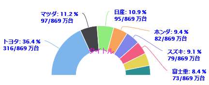
series: [{
type: 'pie',
name: '',
innerSize: '50%', // 中心部分の切り抜きの長さ
data: [
['トヨタ',316], //data書き方2
['マツダ',97],
['日産',95],
['ホンダ',82],
['スズキ',79],
['富士重',73],
['ダイハツ',72],
['三菱自',55]
// ['Chrome', 58.9],
// ['Firefox', 13.29],
// ['Internet Explorer', 13],
// ['Edge', 3.78],
// ['Safari', 3.42],
// {
// name: 'その他',
// y: 7.61,
// dataLabels: {
// enabled: true
// }
// }
]
}]
});
</script>
</body>
</html>
        pie: {
            ・・・
            startAngle: -90,
            endAngle: 90,
            center: ['50%', '75%']
         }
|
 上のサンプルは、y: 0 としたときのタイトルの表示位置 |
<!DOCTYPE html>
<html lang="ja">
<head>
<meta charset="UTF-8">
<!-- レスポンシブ 全デバイス対応 -->
<meta name="viewport" content="width=device-width,initial-scale=1.0,minimum-scale=1.0,maximum-scale=1.0,user-scalable=no">

<title>Highcharts.jsを使って3D半円グラフを描く</title>

<!-- Highcharts 本体 / 3D -->
<script src="https://code.highcharts.com/highcharts.js"></script>
<script src="http://code.highcharts.com/highcharts-3d.js"></script>

<style>
/* レスポンシブ スマホ用の例 */
@media only screen and (max-width: 480px) {
    #body { margin-left: 0; }	/* body */
    #container { margin: 0 auto; text-align: center; }  /* グラフ container */
}
</style>
</head>
<body id=body>
<!-- グラフ表示域 -->
<div id="container" style="width:100%; height:450px;"></div>

<!-- グラフ描写 -->
<script>
Highcharts.chart('container', {
    chart: {
        plotBackgroundColor: null,
        plotBorderWidth: 0,
        plotShadow: false,
        options3d: {   //3D
          enabled: true,     //グラフを3Dに設定
          alpha: 20,         // z 軸を中心にした回転(奥のほうに上向きで倒れる)する角度
          beta: 20,          // x 軸を中心にした左方向に回転する角度
          //depth: 50,       /// ドーナッツの内側の厚さ(深さ)
          }
    },
    title: {
        text: '自動車主要8社2016年国内生産実績(万台)',
        align: 'center',
        //verticalAlign: 'middle',      //ドーナッツの場合、中心部の切り抜き部分にテキストを表示
        y: 40
    },
    tooltip: {
        enabled:true,     // ラベル非表示、マウスオーバーで表示
        formatter: function() {return this.point.name + ':' + this.y + '/'+ this.total +'万台 - ' + Math.round(this.percentage*10)/10 + '%';},
        //pointFormat: '{series.name}: <b>{point.percentage:.1f}%</b>'
    },
    plotOptions: {
        pie: {
            depth: 50,         // ドーナッツの外側の厚さ(深さ)
            dataLabels: {
                enabled: true,
                format: '<b>{point.name}</b>: {point.percentage:.1f} % <br>{point.y}/{series.total} 万台',  // ラベル常時表示
                //distance: -50,
                style: {
                    fontWeight: 'bold',
                    color: 'blue'
                }
            },
            startAngle: -90,            //半円、半ドーナッツ
            endAngle: 90,               //半円、半ドーナッツ
            center: ['50%', '75%']      //半円、半ドーナッツ
        }
    },
    series: [{
        type: 'pie',
        name: 'Browser share',
        //innerSize: '50%',             //ドーナッツの場合、中心部分を切り抜く長さ(割合)
        data: [
               ['トヨタ',316],            //data書き方2
               ['マツダ',97],
               ['日産',95],
               ['ホンダ',82],
               ['スズキ',79],
               ['富士重',73],
               ['ダイハツ',72],
               ['三菱自',55]

        //    ['Chrome', 58.9],
        //    ['Firefox', 13.29],
        //    ['Internet Explorer', 13],
        //    ['Edge', 3.78],
         //   ['Safari', 3.42],
        //    {
        //        name: 'その他',
         //       y: 7.61,
        //        dataLabels: {
        //           enabled: true
        //        }
        //   }
        ]
    }]
});
</script>

</body>
</html>
        pie: {
            depth: 50,         // ドーナッツの外側の厚さ(深さ)px
            ・・・
            startAngle: -90,
            endAngle: 90,
            center: ['50%', '75%']
         }
<!DOCTYPE html>
<html lang="ja">
<head>
<meta charset="UTF-8" />
<!-- レスポンシブ 全デバイス対応 -->
<meta name="viewport" content="width=device-width,initial-scale=1.0,minimum-scale=1.0,maximum-scale=1.0,user-scalable=no">

<title>Highcharts.jsを使って3D半ドーナッツグラフを描く</title>

<!-- Highcharts 本体 / 3D -->
<script src="https://code.highcharts.com/highcharts.js"></script>
<script src="http://code.highcharts.com/highcharts-3d.js"></script>

<style>
/* レスポンシブ スマホ用の例 */
@media only screen and (max-width: 480px) {
    #body { margin-left: 0; }	/* body */
    #container { margin: 0 auto; text-align: center; }  /* グラフ container */
}
</style>
</head>
<body id=body>
<!-- グラフ表示域 -->
<div id="container" style="width:100%; height:450px;"></div>

<!-- グラフ描写 -->
<script>
Highcharts.chart('container', {
    chart: {
        plotBackgroundColor: null,
        plotBorderWidth: 0,
        plotShadow: false,
        options3d: {   //3D
          enabled: true,     //グラフを3Dに設定
          alpha: 20,         // z 軸を中心にした回転(奥のほうに上向きで倒れる)する角度
          beta: 20,          // x 軸を中心にした左方向に回転する角度
          //depth: 50,       /// ドーナッツの内側の厚さ(深さ)。半ドーナッツの場合は無関係。
          }
    },
    title: {
        text: '自動車主要8社<br> 2016年国内生産実績<br>(万台)',
        align: 'center',
        verticalAlign: 'middle',      //ドーナッツの場合、中心部の切り抜き部分にテキストを表示
        y: 50,
        style :
           {
             color: '#FF00FF',
             fontSize: '12px', // have given 50px but not changing
        }
    },
    tooltip: {
        enabled:true,     // 非表示ラベル、マウスオーバーで表示
        formatter: function() {return this.point.name + ':' + this.y + '/'+ this.total +'万台 - ' + Math.round(this.percentage*10)/10 + '%';},
        //pointFormat: '{series.name}: <b>{point.percentage:.1f}%</b>'
    },
    plotOptions: {
        pie: {
            depth: 60,         // ドーナッツの外側の厚さ(深さ)
            dataLabels: {
                enabled: true,
                format: '<b>{point.name}</b>: {point.percentage:.1f} % <br>{point.y}/{series.total} 万台',  // ラベル常時表示
                //distance: -50,
                style: {
                    fontWeight: 'bold',
                    color: 'blue'
                }
            },
            startAngle: -90,            //半円、半ドーナッツ
            endAngle: 90,               //半円、半ドーナッツ
            center: ['50%', '75%']      //半円、半ドーナッツ
        }
    },
    series: [{
        type: 'pie',
        name: 'Browser share',
        innerSize: '55%',             //ドーナッツの場合、中心部分を切り抜く長さ(割合)
        data: [
               ['トヨタ',316],            //data書き方2
               ['マツダ',97],
               ['日産',95],
               ['ホンダ',82],
               ['スズキ',79],
               ['富士重',73],
               ['ダイハツ',72],
               ['三菱自',55]

        //    ['Chrome', 58.9],
        //    ['Firefox', 13.29],
        //    ['Internet Explorer', 13],
        //    ['Edge', 3.78],
         //   ['Safari', 3.42],
        //    {
        //        name: 'その他',
         //       y: 7.61,
        //        dataLabels: {
        //           enabled: true
        //        }
        //   }
        ]
    }]
});

</script>

</body>
</html>
        pie: {
            depth: 60,         // ドーナッツの外側の厚さ(深さ)px
            ・・・
            startAngle: -90,
            endAngle: 90,
            center: ['50%', '75%']
         }

最終更新日:2018.8.12 初版,2023. 8.11 |
メール mailto: |
掲示板 |